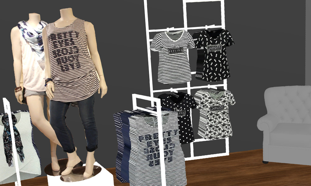
5 Store Styling Tips Every Visual Merchandiser Can Use To Improve Customer Experience
Visual Merchandising is all about presenting your products to customers in the most attractive way - with a focus on driving commercial performance. Merchandising professional quality displays - with the help of well planned directives - not only helps you sell more, it improves your in-store customer experience and strengthens your brand. So what tips and tricks should every Visual Merchandiser utilize when creating inspirational store displays that convert shoppers into customers? Read on to find out.
1. Grouping by style or type
A high density of products needs to be balanced with a practical way for customers to interact with them. This could be by brand, product type, color or by price.
Grouping separate categories or styles of clothes - like the examples to the right - ensures there is a clear defined space that can easily be interacted with.
It's one of the most common tools in a Visual Merchandiser's toolkit, especially when space is at a premium.
2. Storytelling through visual concepts
Storytelling in Visual Merchandising is a way to incite imagination. A tight visual concept can give a potential customer inspiration for a certain style, and can trigger an aspirational feeling. Simply, it's all about conveying a theme through the way your products are laid out.
You can use this concept to great effect when creating your store display. For example, coordinating of a collection of products - just like the yellow and black Autumnal look on the right - is a great example of inspiring customers through storytelling when combined with the right props and signage.
3. Color balancing
How a Visual Merchandiser utilizes color is one of the most important aspects of the job. From the planning stage, creating product collections and ranges based on color can heighten the cohesiveness and visual styling of your store.
Whether you go for a high-contrast dramatic look or a palette of matched tones, what's important is that you balance them well and utilize an array of placement and spacing variations to achieve the right feeling.
4. Using symmetry in your displays
Repeating the way your products are folded, stacked, hung and styled in symmetrical ways can elevate your store's visual feeling.
When repeating products around a focal point - in this example a table fixture - and using symmetry in styling your display, you can also look to incorporate different color balancing techniques to deliver an even more striking look.
5. Focal points
A focal point is a hotspot - in a store window for example - that acts as the centrepiece in combination with styled mannequins or displays, props or signage. Place focal points in key sight lines, endcaps and entrance tables to a store or department.
The focal point acts as the 'draw' and can compel a shopper to enter the store - or a specific area of your store - and take a closer look at your products.

 Français


