5 ways ASDA George optimised their retail planning and visual merchandising
Retail planning covers everything from the buying stage all the way to creating and merchandising collections in store. However outdated and bloated processes often make retail planning more time-consuming and inefficient, much to the detriment of the customer experience. So how did fast-fashion retailer ASDA George make their planning more effective - and in turn create a more inspirational experience for their loyal shoppers? Read on to learn 5 ways how.
1. Better collaboration between teams
One of ASDA’s key goals was to improve the collaboration between buying and merchandising teams. Easier collaboration means teams can be more productive and creative - all helping to work towards their main goal of delivering a better in-store experience for customers.
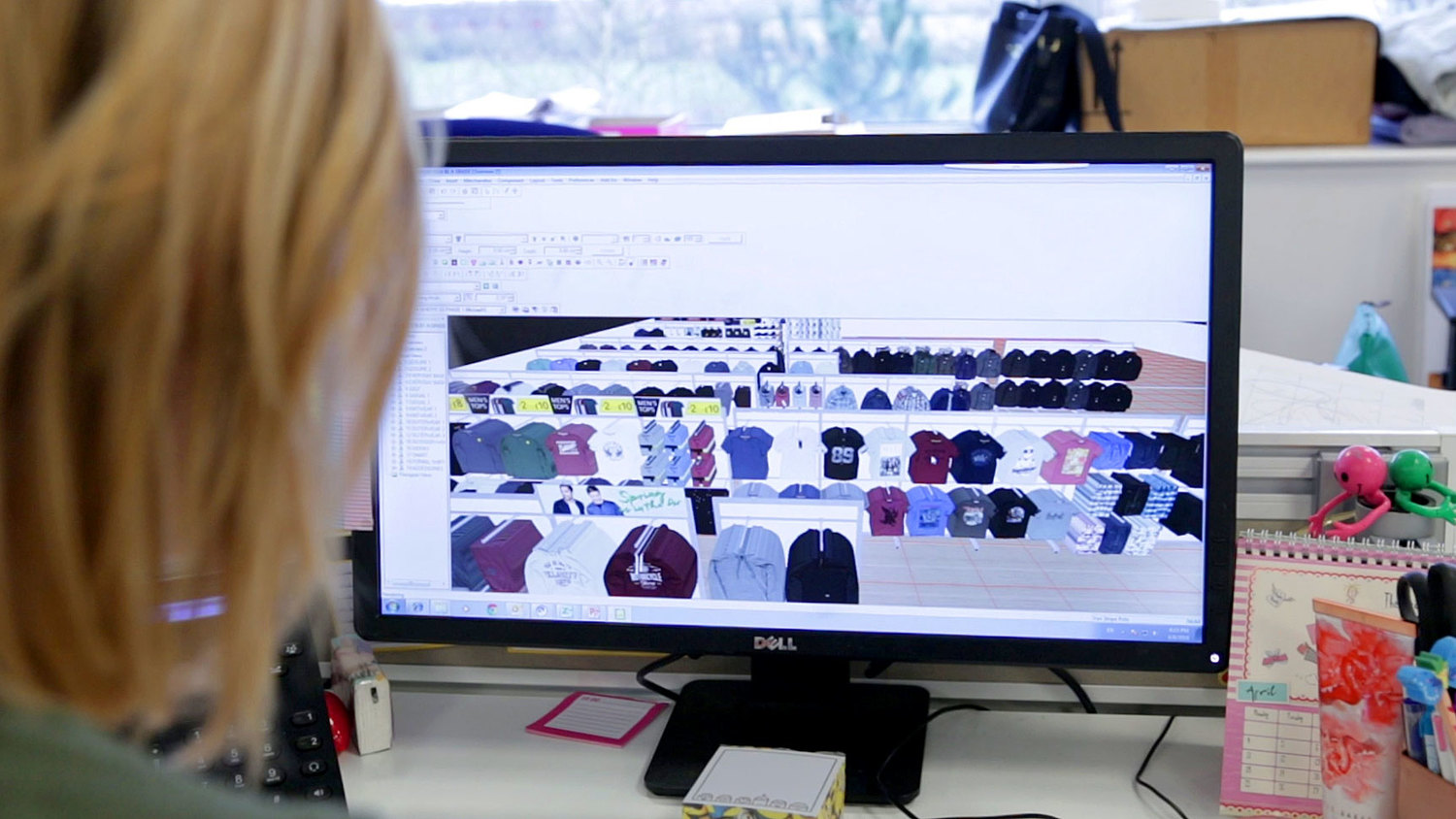
As an example, ASDA’s use of the MockShop software enables them to come up with new merchandising ideas on the fly, without having to spend a great deal of time going back and forth between departments.
Kate Bowler, Sales Development Coordinator, explains the benefit of using technology to empower collaboration: “We can do a bit of a focus group and get some opinions going...you can do it all on your screen and because the image quality is so good you don’t need to mock it up in real life”
2. More relevant directives sent to stores, faster
Having over 240 stores across the UK means that inevitably, they will not all look the same. Many of them are differently sized and differ in availability of fixtures like gondolas and backwalls. Now picture sending visual merchandising guidelines to all of them at the same time - all of them will not be able to follow them exactly as intended.
Michael Howard, Sales Development Manager explains the problem in a nutshell: "Stores would only receive a top store directive so the smaller stores and the mid stores found it very difficult”
To combat this, ASDA now creates planograms and VM directives that are relevant to store size. This means that each store cluster receives one that is more easily understood - as only pertinent information is given. This in turn makes it much quicker and easier for the field teams to execute these guidelines.
3. Going paperless
Whilst going paperless doesn’t affect the end-consumer in any noticeable way, the switch to a digital ecosystem is invaluable in both saving money and keeping a better, more easily accessible record of all steps in the retail planning process.
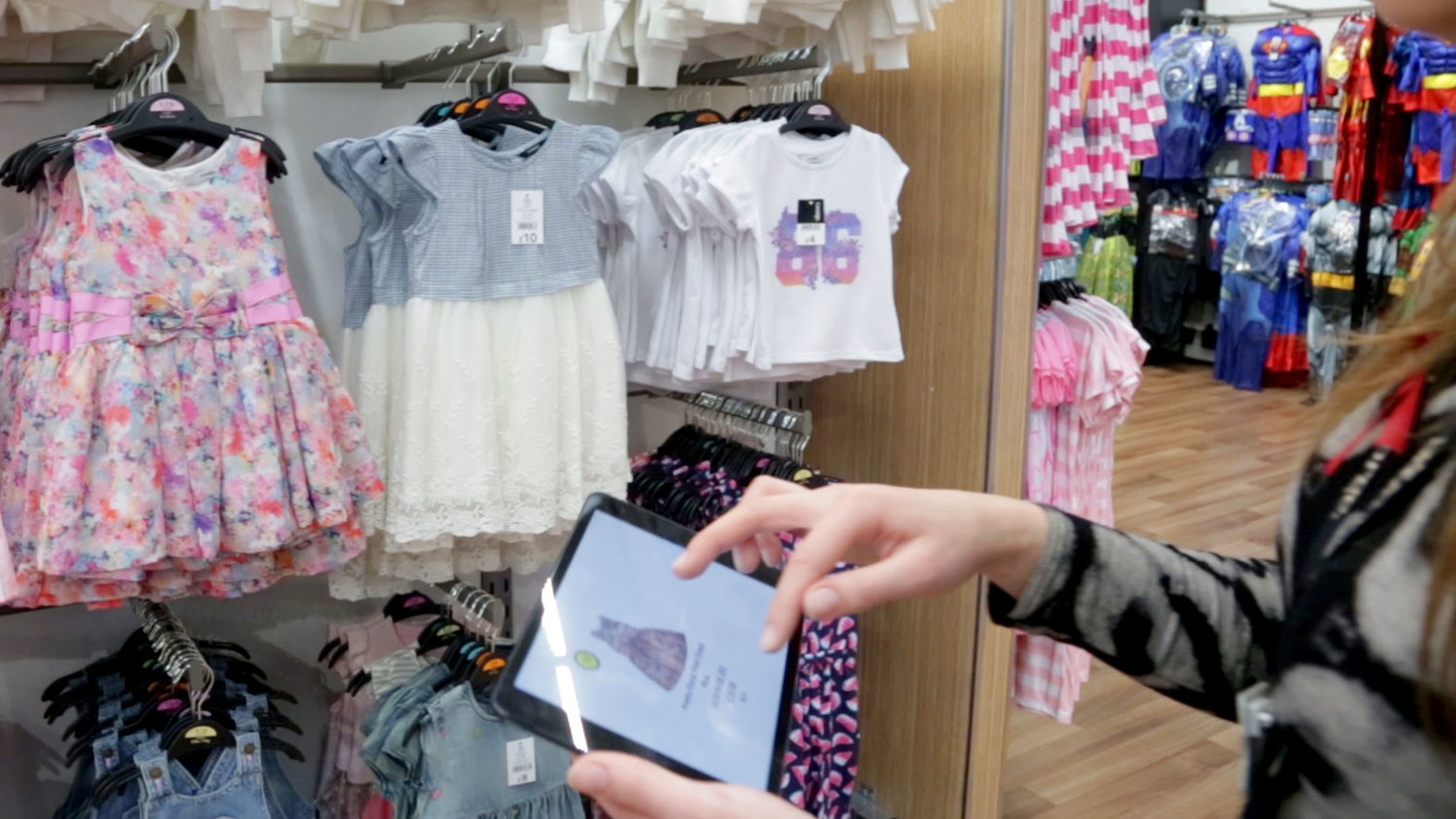
By looking to create an end-to-end digital solution, the need to print can be completely removed. For example product collections can be created and analysed on software to then be merchandised in a virtual environment. The digital mock up can then be published to a planogram which gets sent out to field merchandising teams using iPads. All of these steps can be recorded, amended and accessed from a centralised point along the way - something that using physical means simply can’t offer.
What’s more is that it saves money and helps the environment too - as Mark Matthews, Senior Director of Retail explains: “From the transition over to Visual Retailing, just by reducing the quantity of the paper we’ve saved over £100,000 GBP per year.”
4. Using digital mock up stores instead of physical ones
Mock up stores are used by many retailers to test and experiment different store layouts, how certain collections will be merchandised, how point-of-sale material can look - and much more. Having a physical one is certainly useful for having a real representation of the final outcome, but with this comes extra financial costs in merchandising it (not to mention time wasted).
ASDA's Michael Howard explains the drawbacks of using a physical mock-up store “What we used to do was rack all of our products up in a large mock up store, walk around with the senior directors and get sign off for that process. We would then take pictures and brief our store colleagues on how we want to merchandise the products.”
Having a digital mock up store blows open the possibilities of experimenting with new layouts and merchandising ideas. Now there is no need for senior directors to walk around, or pictures being taken to brief store colleagues - as this can all be done digitally from one system.
5. An automated, visual planogram
A planogram is essentially one part of a set of visual merchandising guidelines. The planogram refers to the store layout and where products should be added to certain fixtures. Now when it comes to clothing, a planogram that doesn't have visuals of the products makes it hard to identify and ensure the right ones are being merchandised. Next, the creation of the planogram can take a lot of time as products have to be manually added.
ASDA George decided that in order to send new guidelines every 6 weeks in a much more cost and time-effective way, a change in process was needed. That change? Automating the creation of a planogram that's also highly visual.
With a visual planogram "It’s so much easier for [the teams] to identify the product[s] within” and now "the process is so much quicker" according to Sales Development Manager Howard.

 Français


