5 Design Upgrades That Will Transform Your Store
3 mins read
by Ford Hudson
To compel your customers to spend their hard-earned cash, there are tons of tricks up a retailer’s sleeve, most of them subconscious. And one of these subconscious tricks lies in the level of attention given to the interior design of a space.
While most retailers purchase an existing brick and mortar store, it may come with a few hand-me-down fixtures and unattractive, outdated items. In fact, it’s quite possible the entire store is in desperate need of an upgrade.
But before you go gutting the entire store, consider your budget. It’s important to hone in on the priorities and recognize the simpler, more cost-effective ways a retail store can be improved without chipping away at your new business’s overhead right from the start.
Here are some easy design upgrades that will transform your store into a more inviting space for your customers.
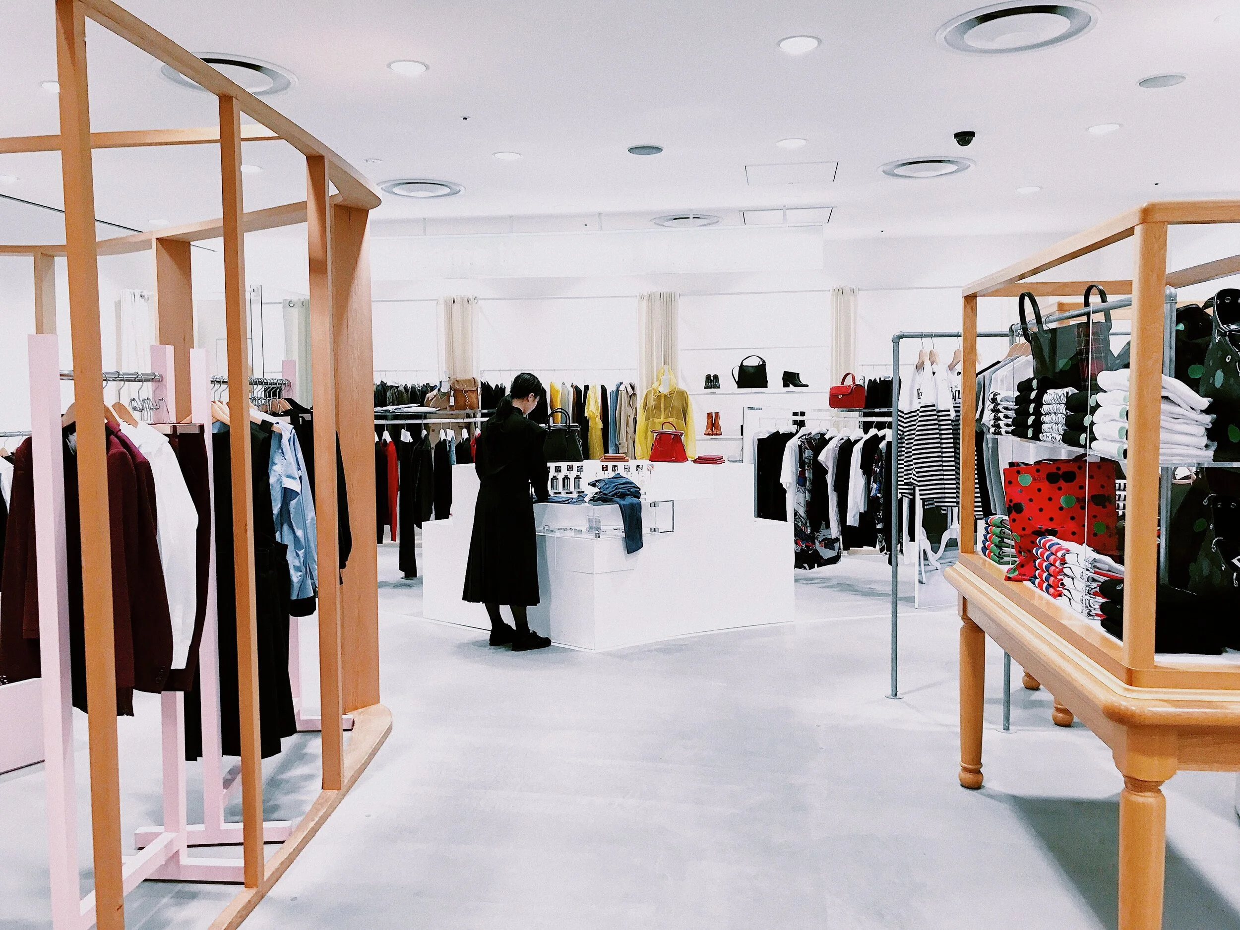
Keep Merchandise Organized
Consider the path your customers take throughout your store. Is there a flow that pulls your customers deeper? While placing more enticing merchandise toward the entrance, it’s still important to pull them toward the back and have them fully engage with the products.
However, you can organize your store in a way that creates a path that invites customers while respecting a shopper’s personal space. Try to eliminate clutter within the “decompression zone,” which is considered the first five to fifteen feet. Doing so allows a customer to transition, shifting from their busy lives to a more relaxed atmosphere.
Placing newer items in the storefront window draws customers in, while the rest of the store guides them throughout, increasing sales.
Upgrade the Flooring
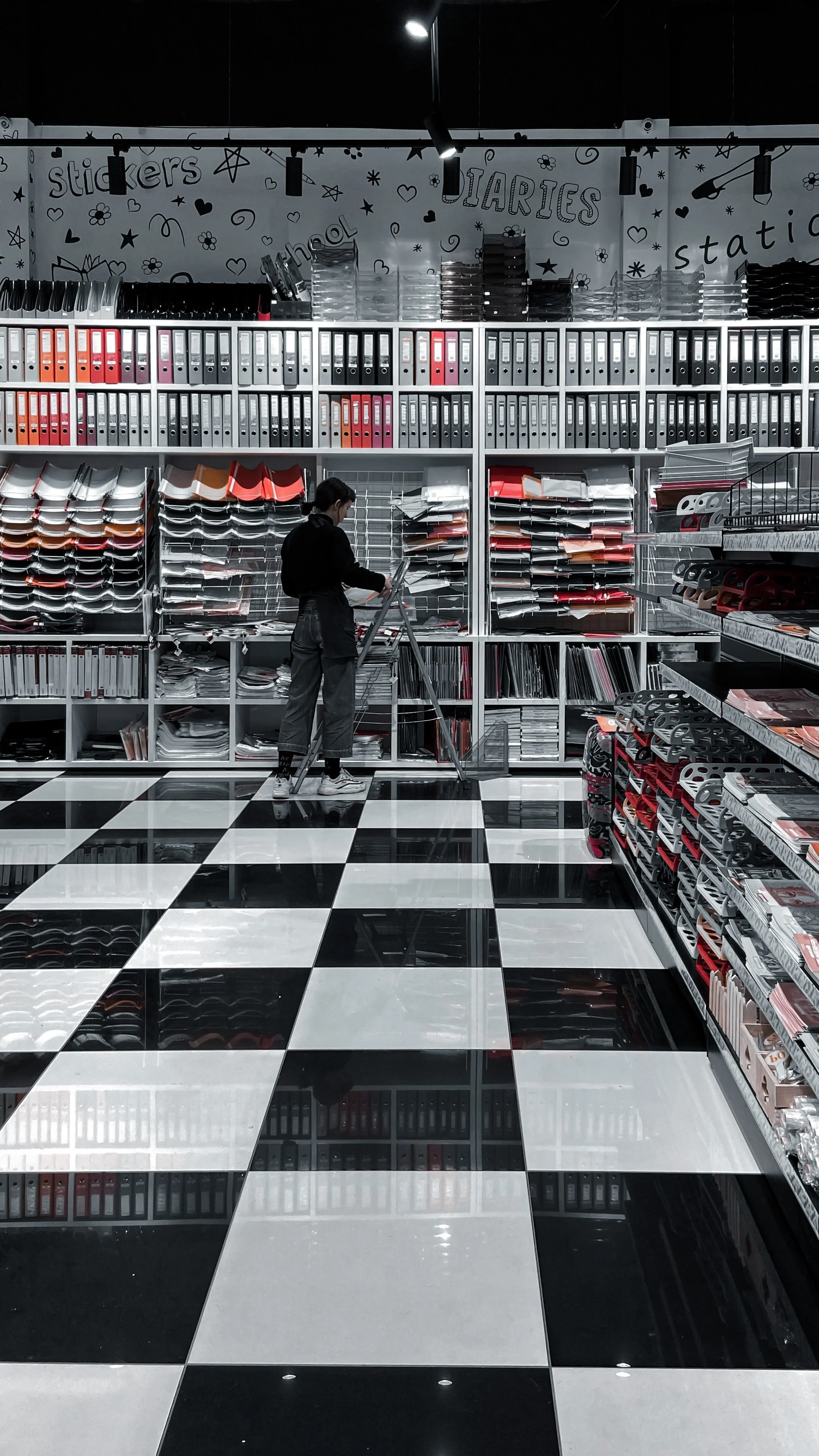
Between the neatly organized racks, stands and display tables, your customers will see the floors. Your store’s flooring may seem like a last thought, but it can truly make the space, guiding customers subconsciously the direction you want them to go. You can upgrade your flooring with patterns and designs that highlight different sections and improve traffic flow.
And to make the flooring last, you’ll also want to consider something more durable like vinyl planks and tiles, made to resemble wood floors while still capable of being used in high-traffic areas. Other flooring examples for high-traffic areas are waterproof flooring and engineered stone.
Create a Feature Wall
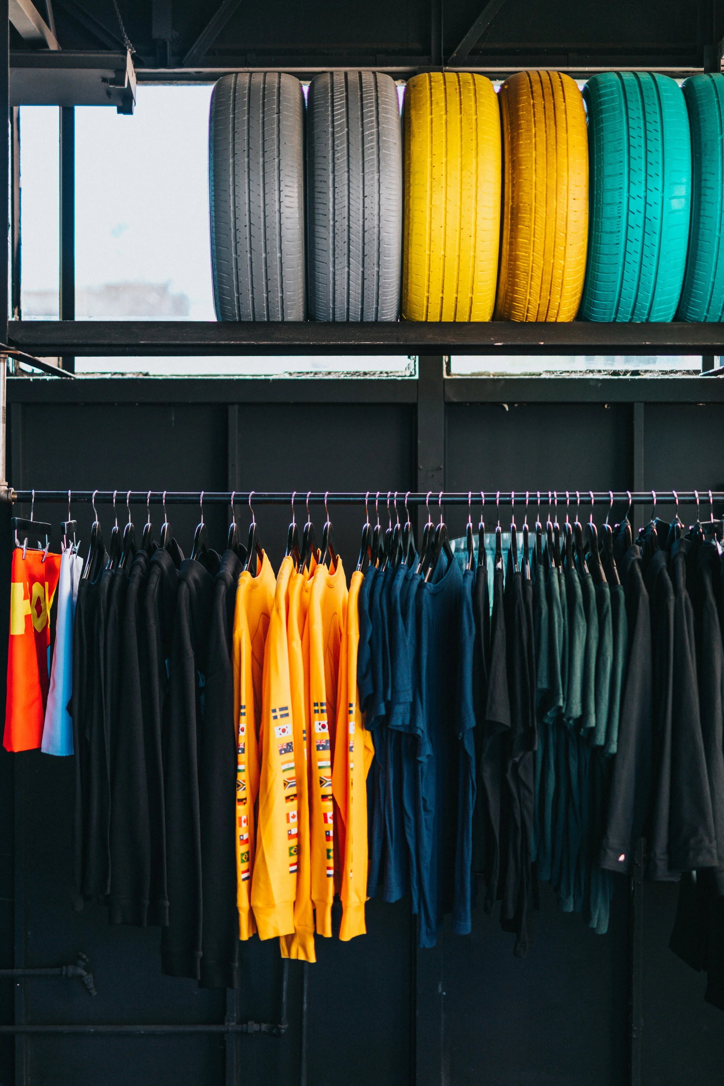
Another design upgrade that is sure to capture customers’ attention is a feature wall. Features walls are also a great way to increase store profits.
To make a great first impression, feature walls are typically near the entrance to portray the brand image as soon as customers enter the store. However, if a store is spacious enough, multiple feature walls can also be used. This can be an accent wall behind your register or even placed all the way in the back of the store, pulling customers deeper. A feature wall can be anything from a hanging garden to a large piece of artwork.
Add a Lounge Area
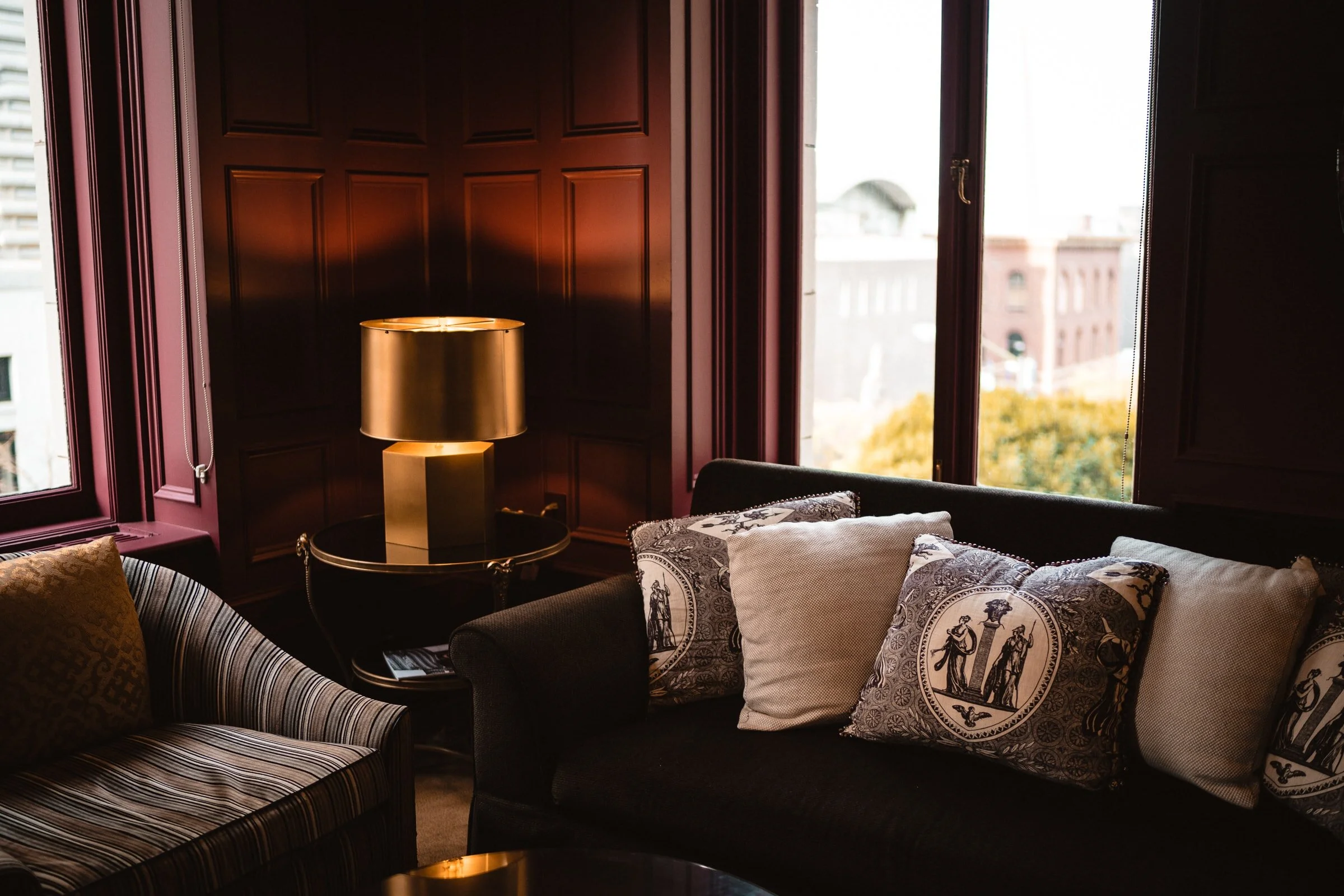
Adding a lounge area is another excellent design upgrade that is sure to boost traffic to your store. Customers who find a lounge area tend to feel more at home, able to relax in a stress-free, no-hassle environment. A lounge area is a perfect addition to a fitting room, allowing friends to partake in the whole shopping experience.
Along the same lines, why not offer some complimentary refreshments such as tea or coffee for customers to enjoy. After spending hours in a store, some customers simply need to leave to grab a bite or else get “hangry” and irritable (possibly even at staff). For this reason alone, light snacks are not a bad option either.
Adding a lounge area and creating a more informal atmosphere removes the pressure to purchase and brings an added level of trust to your customer base. However, as always, it’s important to consider what your customers would want. If you sell workout apparel, provide a healthier alternative like juice or cucumber water. Ultimately, be sure to align with your brand.
Stretch this upgrade a bit further and even offer beer or wine. Studies show that shoppers with a bit of a buzz spend cash more readily. For example, jewelry stores that sell engagement rings offer a couple a glass of champagne as they try rings on for size. While this example was once reserved for more high-end retail establishments, it’s not uncommon to offer customers this service today and adds a nice touch.
Upgrade Lighting
When it comes to designing a retail space, three types of lighting need to be used: ambient, task and accent lighting.
Ambient lighting is the overall lighting that casts a general glow. On the other hand, task lighting allows consumers to locate items. Accent lighting, when used minimally and sparingly, can also be the most effective, pinpointing and highlighting sale items or merchandise you want to move quickly.
Retailers can add these three types of lighting by installing tracks, recessed lights, wall sconces and even chandeliers. But a combination and variety is the key to a successful lighting plan.
Natural lighting is also a good source. If a retail space features wide and spacious windows, incorporate it with the other main three lighting upgrades. Typically, the more variety of lights you implement in your store’s design, the better the merchandise sells.
Transform Your Store Today
For retailers, the bar is set pretty high. Not only do you have to compel shoppers to enter your store instead of shopping at your competitor or online, but you have to keep them interested enough to spend money and keep them coming back for more.
One of the top ways to succeed in this is to give your store a design upgrade that is sure to transform it. Sprucing up your floors or adding a feature wall can truly go a long way. Implement one of these five design upgrades and you’ll have loyal customers returning to your store over and over.
About the author
Ford Hudson is a Marketing Manager at Twenty & Oak. Every flooring product on Twenty & Oak has been hand-selected for its outstanding performance, beautiful craftsmanship, durability, and environmental sustainability. Ford is passionate about the environment and thoughtful interior design. That’s why his work for Twenty & Oak is so important to him. A Charleston, SC native and avid Gamecocks fan he loves spending time within nature and cheering his team on.

 Français


